The 2023 NBA playoffs showcased an array of impressive performances that captivated basketball enthusiasts worldwide. To gain deeper insights into the numbers behind these standout moments, Tableau’s data visualization capabilities were utilized to analyze player data from the tournament. In this article, we will present the key observations and interesting findings from the Tableau story, shedding light on the exceptional abilities of NBA players during the playoffs.
Project Goals
- To utilize Tableau to visualize and analyze player performance data from the 2023 NBA playoffs.
- To uncover unique patterns and standout performances in the tournament through the use of different types of visualizations such as bubble charts, bar graphs, heat maps, and tree maps.
- To analyze team and individual scoring dynamics, including the distribution of total points among players and the contribution of the top players.
- To evaluate 3-point shooting accuracy across different teams and player positions and identify standout performances.
- To highlight the role of different player positions in game dynamics, such as assists, with a particular focus on unusual cases like Nikola Jokic.
- To draw insights from the data that can be useful for basketball enthusiasts, players, coaches, or sports analysts in understanding the intricacies of the game and the impact of individual players.
Data Sets Used
Two datasets were used:
- The first data set includes the average metrics for each player per game. This dataset was used for slides 1, 4, and 5.
- The second data set includes the total metrics for each player. This dataset was used for slides 2 and 3.
These tables were joined on the player column using Tableau.
The Tableau Story
In a past endeavor, when I delved into an analytical study of educational data from Massachusetts, I utilized a dashboard created through Tableau. I incorporated a story format for this particular project and found it to be a beneficial learning experience. Check out my Tableau story by clicking on the link or one of the images below.
Slide 1: Charting the All-Around Players
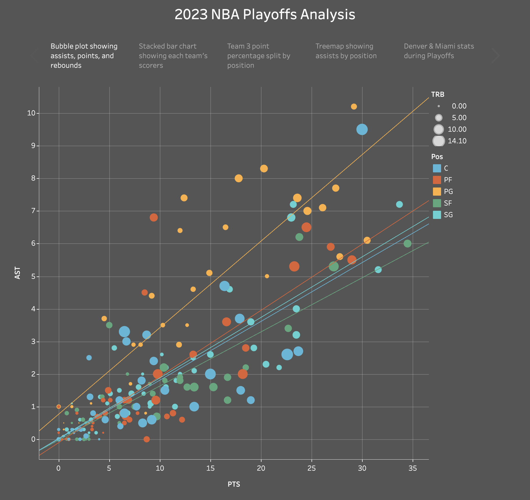
Their initial point of focus is a bubble chart that depicts the average assists, rebounds, and points earned by every player. Points find their place on the x-axis, assists on the y-axis, and the magnitude of the bubbles denotes the quantity of rebounds. The different positions of the players are indicated through the use of color codes.
There is one player who breaks the mold - Nikola Jokic. Despite his role as a center, Jokic’s assist record is remarkably higher than the average player in his position, effectively spotlighting his capacity as a playmaker. His aptitude for rebounds additionally bolsters his standing as a significant player on the field.
Included in the chart are regression lines for each position. Based on these regression lines, it was inferred that point guards generally account for the most assists in relation to points. Meanwhile, centers take the lead in gathering the most rebounds. In an unexpected revelation, shooting guards, small forwards, power forwards, and centers appear to have similar point / assist ratios to each other.
Slide 2: Scoring Dynamics Across Teams
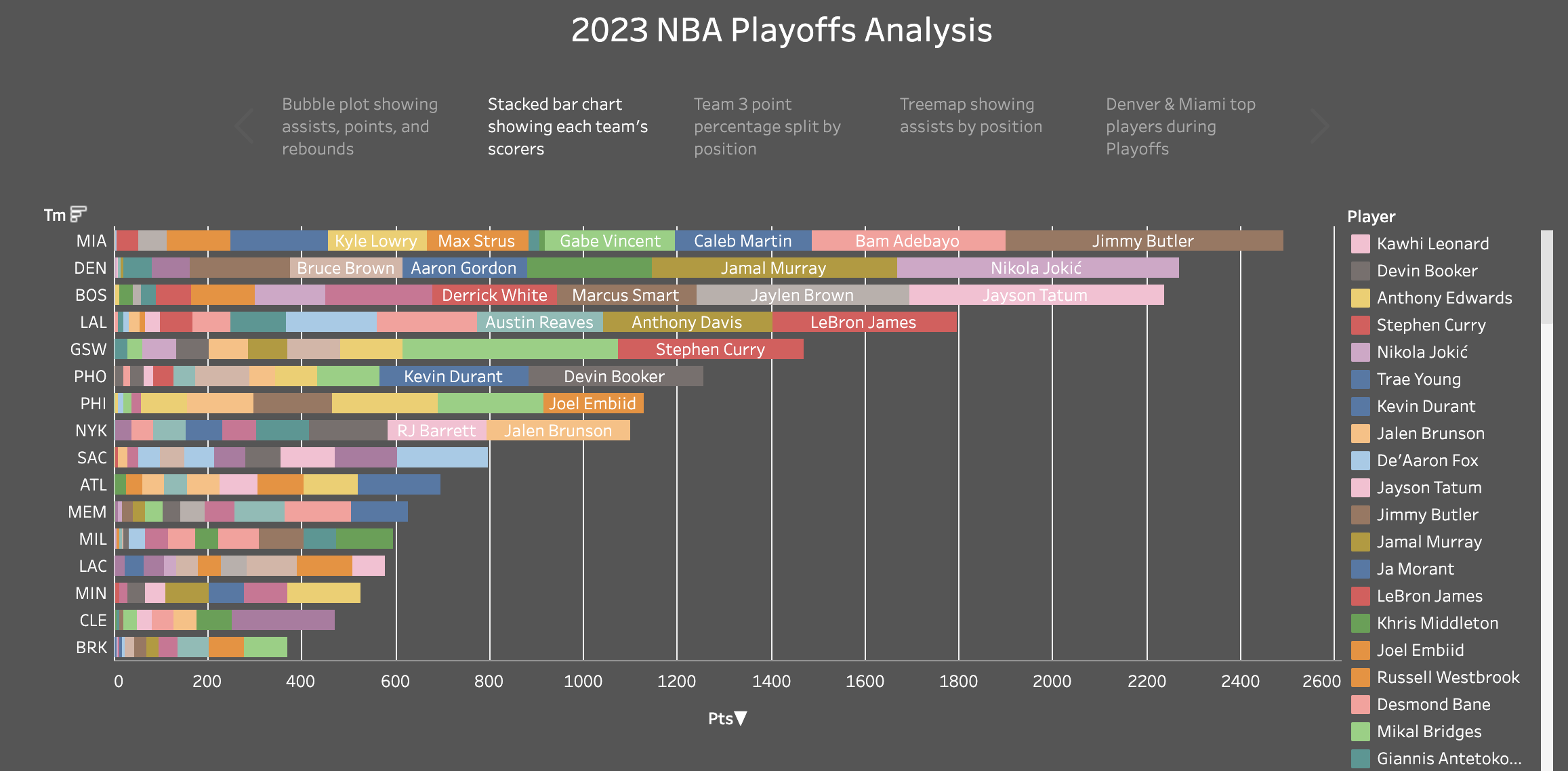
A stacked bar chart was devised to depict the sum total of points each team racked up in the playoffs. As would be expected, those teams that were knocked out earlier in the series exhibit a smaller total point tally. It’s logical to find Miami and Denver leading the pack in terms of total points since they were the teams that made it all the way to the finals. Despite Denver’s ultimate victory, Miami recorded a higher aggregate of points. Yet, within the individual player statistics, it was Nikola Jokic who towered above all others, with an impressive score of 600 points during the playoffs.
An additional intriguing trend was discerned. It seems that the contribution of the top three players from each team is approximately equal to the total points scored by the remaining members of their respective teams. This pattern was noticeable across all sixteen teams. Interestingly, in some of these teams, the top trio of players managed to outscore the rest of their teammates.
Slide 3: Beyond the Arc - 3-Point Prowess
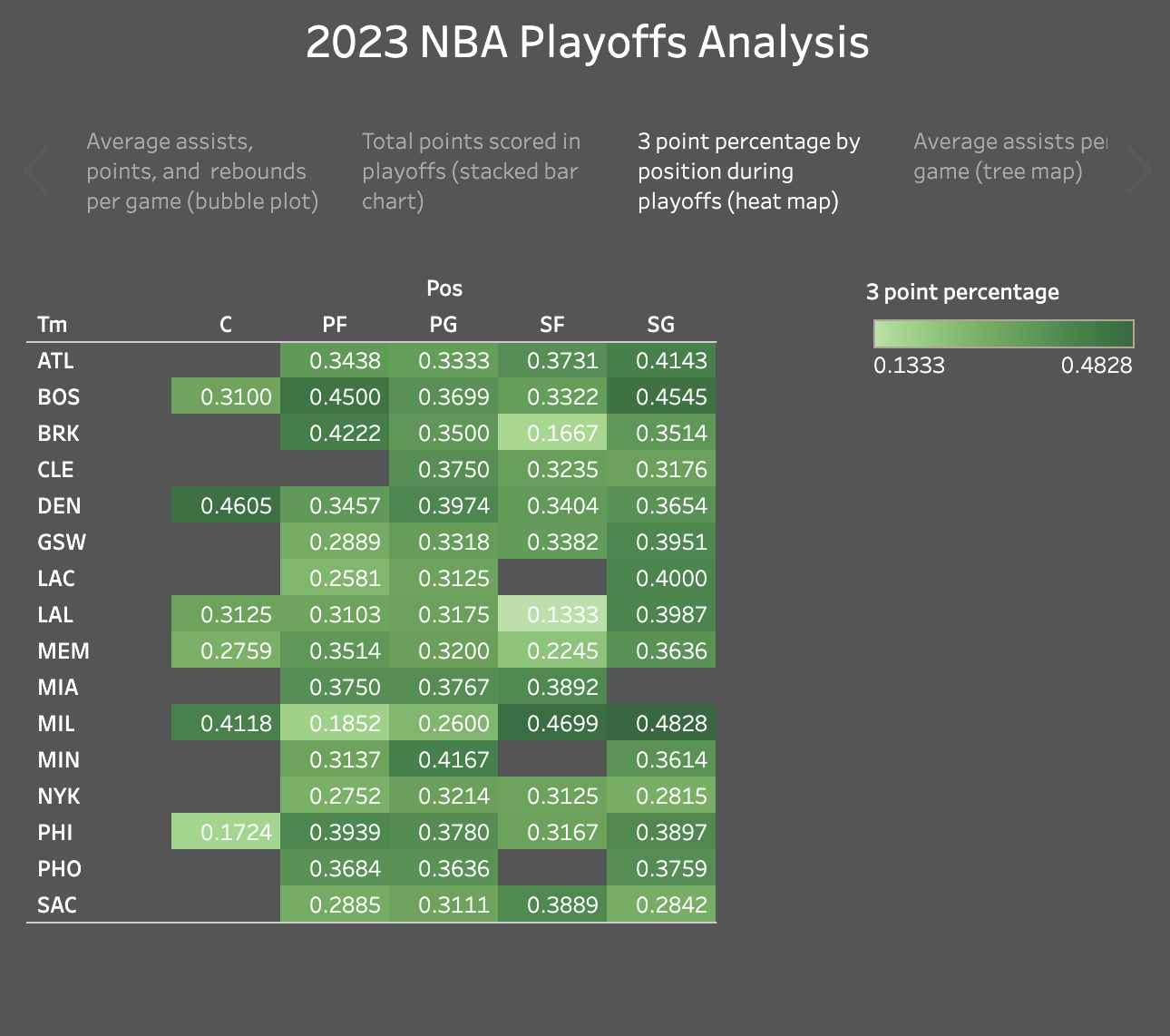
A heat map illustrating the 3-point percentage for each position within each team was generated. However, positions with fewer than 12 attempted 3-point shots were omitted from the heat map. This exclusion was necessary to ensure the reliability of the data, as a limited sample size could be influenced significantly by chance occurrences and might not accurately represent the true shooting abilities of those positions.
Several positions stood out:
- The small forwards for the Milwaukee Bucks made 46.99% of 83 attempted 3 pointers.
- The shooting gaurds for the Milwaukee Bucks made 48.28% of 29 attempted 3 pointers.
- The centers for the Denver Nuggets made 46.05% of 76 attempted 3 pointers.
- The shooting gaurds for the Boston Celtics made 45.45% of 110 attempted 3 pointers.
- The power forwards for the Boston Celtics made 45% of 40 attempted 3 pointers.
Slide 4: Assists by Position
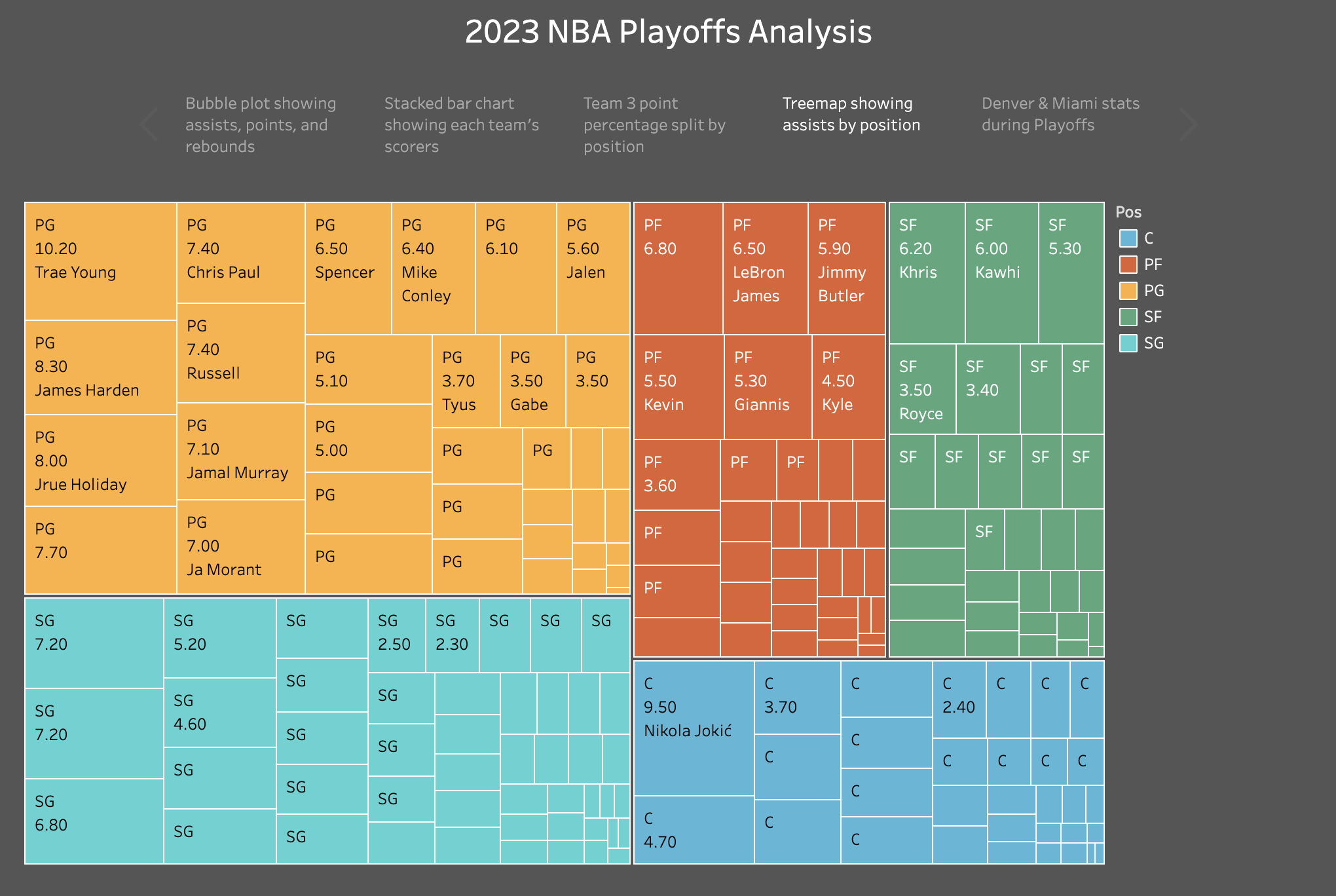
Assists play a pivotal role in team strategy, and this treemap breaks down assists by position. As expected, point guards dominate this category, showcasing their essential role in facilitating teamwork. One standout player, Trae Young, secures the highest average assists, reflecting his crucial role in guiding his team’s offense.
An interesting observation is once again Nikola Jokic, the center who surprisingly secured the second-highest number of assists overall, an exceptional feat for a position not typically known for playmaking abilities.
Slide 5: Unraveling the NBA Finals Stars
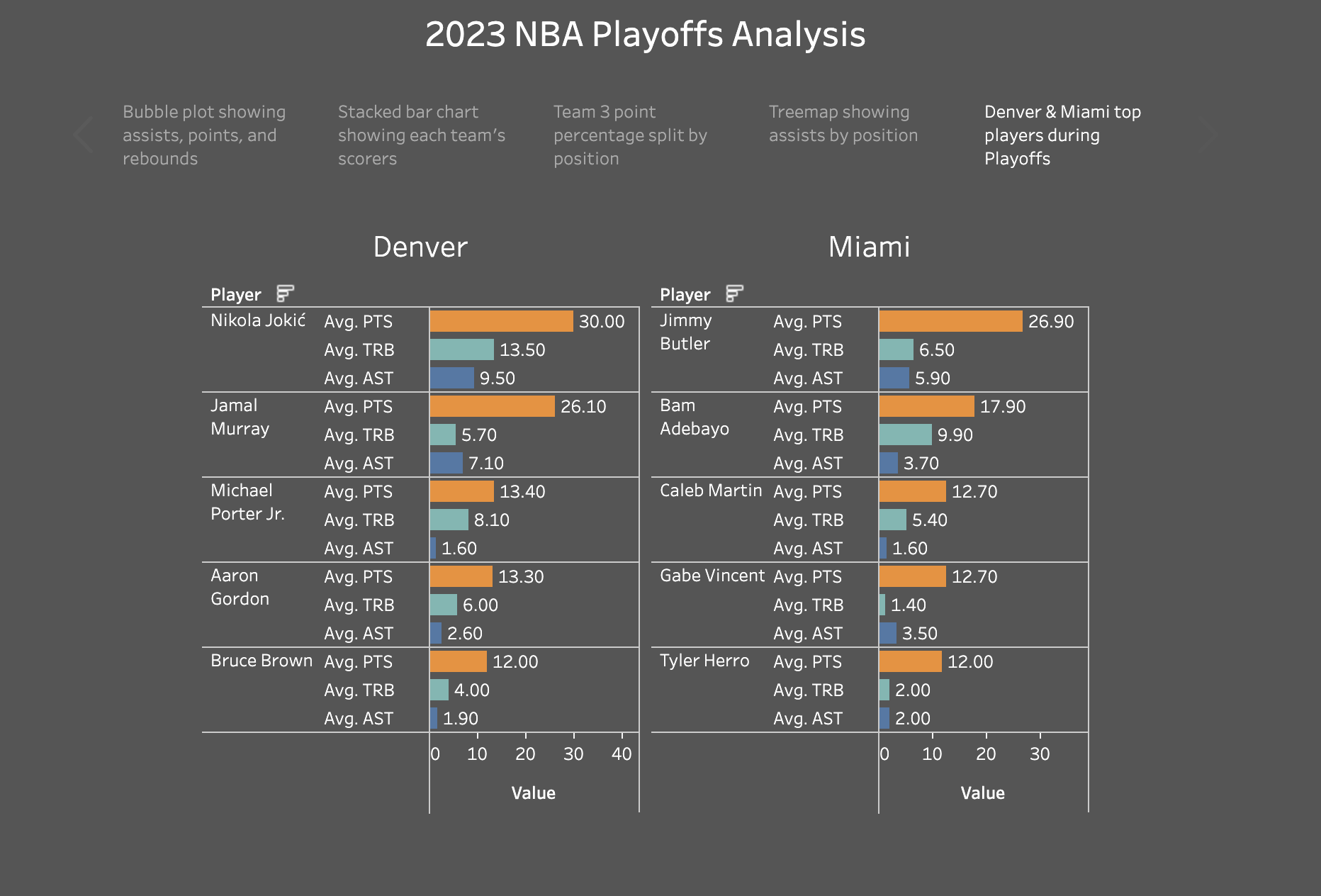
In the NBA Finals, the spotlight is cast upon the top 5 players from the two competing teams. Notably, Nikola Jokic emerges as a powerhouse, becoming only the 7th player to accomplish two triple-doubles in an NBA Finals, thereby cementing his status as an extraordinary all-around player. Scoring well over 10 points in each game, and averaging 13.5 rebounds and 9.5 assists per game, Jokic was remarkably close to sustaining a triple-double average throughout the entire playoffs. These compelling stats not only embody his spectacular performances during the tournament but also showcase his consistent, high-level play.
Alongside Jokic, Jamal Murray has also proven himself to be a robust asset to the Denver Nuggets, showcasing his basketball acumen and significantly contributing to the team’s success. Meanwhile, on the Miami Heat side, Jimmy Butler’s impressive stats stood out, demonstrating his critical role and influence on the team.
In this exploration, powered by Tableau, the exceptional talents and standout moments of NBA players during the 2023 playoffs are brought into focus. The figures weave an intriguing narrative, laying bare the players’ prowess and the electrifying moments that captured the attention of basketball fans across the globe.
Key Observations
- The use of Tableau revealed interesting patterns such as the role of point guards in assisting and centers in rebounding, with surprising exceptions like Nikola Jokic.
- Teams that stayed longer in the playoffs naturally racked up more points, but individual player contributions varied significantly, with top trios often equalling or outperforming the rest of their teams.
- Precision in 3-point shooting varied across teams and positions, with standout performances from certain positions within the Milwaukee Bucks, Denver Nuggets, and Boston Celtics teams.
- The treemap visualization emphasized the pivotal role of point guards in assists, with Trae Young securing the highest average and Nikola Jokic, as a center, performing unusually well in this category.
- The NBA Finals highlighted exceptional players like Nikola Jokic, who became the 7th player to achieve two triple-doubles in the NBA Finals, and other top players who showcased their exceptional talents during the 2023 playoffs.
Future Applications
The application of Tableau’s powerful data visualization capabilities in analyzing NBA player data opens the door to numerous future possibilities. Beyond the playoffs, teams and analysts can use similar techniques to gain a comprehensive understanding of player performance throughout the regular season. This data-driven approach can aid in strategic decision-making, player scouting, and game planning, ultimately enhancing a team’s competitive edge.
Moreover, the insights gleaned from Tableau’s visualizations can also be extended to various aspects of basketball analytics, such as studying team dynamics, performance trends over multiple seasons, and even assessing the impact of coaching strategies on player development. As technology continues to evolve, data visualization tools like Tableau hold immense promise in revolutionizing sports analytics and providing deeper, data-backed insights into the world of professional basketball.
